🐨 Koala Lab Redesign Series: Email UX Edition
Starring: Her First $100K
If you’ve ever found yourself squinting at a dense block of email copy, wondering what the actual CTA is… you’re not alone.
As a CRM & email nerd (and a huge fan of Tori Dunlap and the team at Her First $100K), I recently gave one of their marketing emails a gentle UX glow-up.
Not because it wasn’t already packed with value but because great content deserves a layout that works harder.
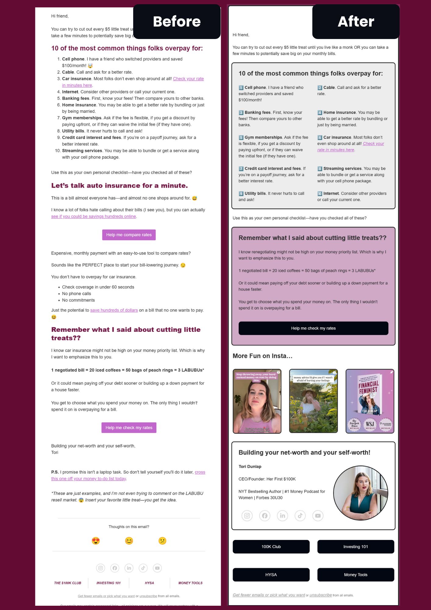
💌 The Original Email: What Worked vs What Struggled

Here’s what the email nailed:
✔️ Smart tips on saving money
✔️ Relatable, empowering voice
✔️ Clear product links and a no-sleaze sales pitch
Where it needed love:
🧱 Dense layout = harder to skim
📉 Buried CTA = less chance of action
🪜 No clear visual hierarchy = high bounce risk
📱 Not fully optimized for mobile brains (aka all of us)
✨ The Redesign: What I Changed (and Why)
Here’s how I approached the makeover from a UX + engagement lens:

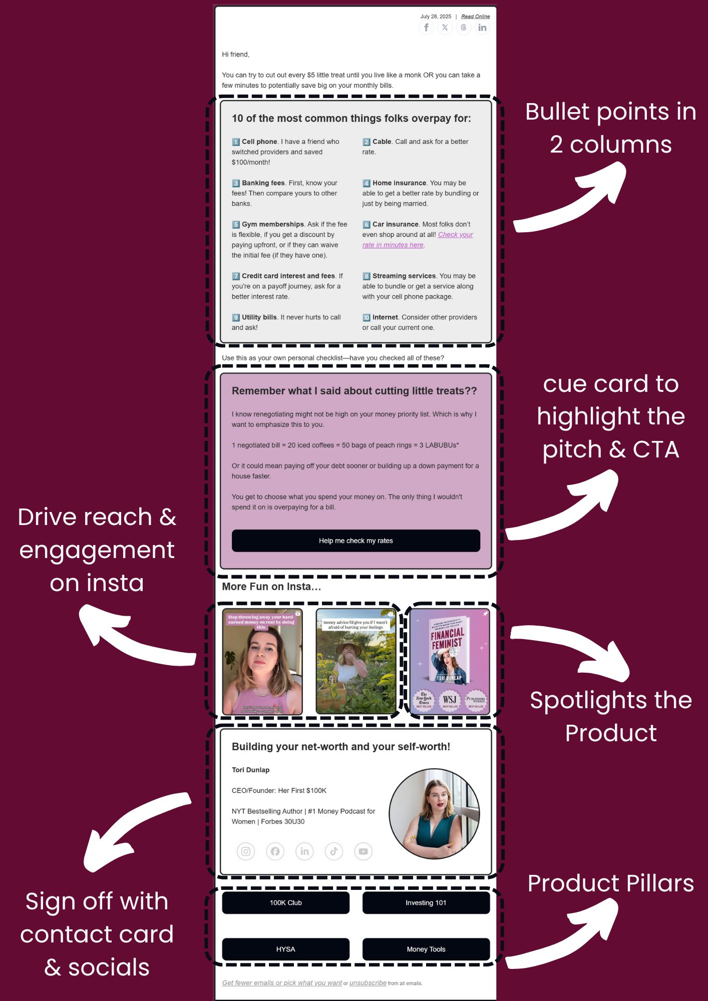
1. Bullet Points → Two Columns
Breaking the list in half made it easier to scan quickly—especially on mobile.
2. Highlighted Cue Card for the Insurance Pitch
Instead of burying the offer in a paragraph, I pulled it into its own box with a bold CTA. No distractions, no guessing.
3. "Cutting Treats" Analogy → Branded Visual Block
This section was gold. I just gave it a pink cue card moment to match the brand and give it the emphasis it deserved.
4. Added an Instagram Section
As a creator, cross-channel engagement is key. This section was designed to drive more reach and repurpose content already performing well on socials.
5. Visual Sign-Off with Contact Info
Instead of ending with just text, I brought in a visual sign-off with Tori’s photo, credentials, and links to all her key platforms—like a mini “about the author” card.
6. Clear Navigation for Core Products
Buttons at the end direct readers to the 100K Club, Investing 101, HYSA, and more—making it super easy to take the next step.
📌 Final Takeaway
Designing for email is designing for micro-decisions.
And good UX isn’t just about looking pretty, it’s about making action frictionless.
So if you’re a creator, founder, or side hustler sending emails, ask yourself:
Can your reader skim and act in under 5 seconds?
Are you guiding their eye or making them work for it?
Are you giving your content the layout it deserves?
This redesign was part fan-art, part case study, and 100% proof that email UX matters more than we think.
💭 Want help reimagining your own emails?
I help creators and businesses make their emails clearer, more clickable, and way more fun to read.
Let’s chat → https://www.koalalab.rocks/services