Half-Baked Thoughts 🍀🚬
Riddle: What’s a marketer’s favorite Halloween candy?

I’ve been a long-time fan (and follower) of She’s on the Money. They do incredible work empowering women through financial education and their mission to make money conversations accessible to everyone is something I deeply admire.
Their emails are already fantastic especially after their recent brand relaunch (seriously, go check them out if you haven’t yet). So, this isn’t a critique - it’s a creative crush 💗

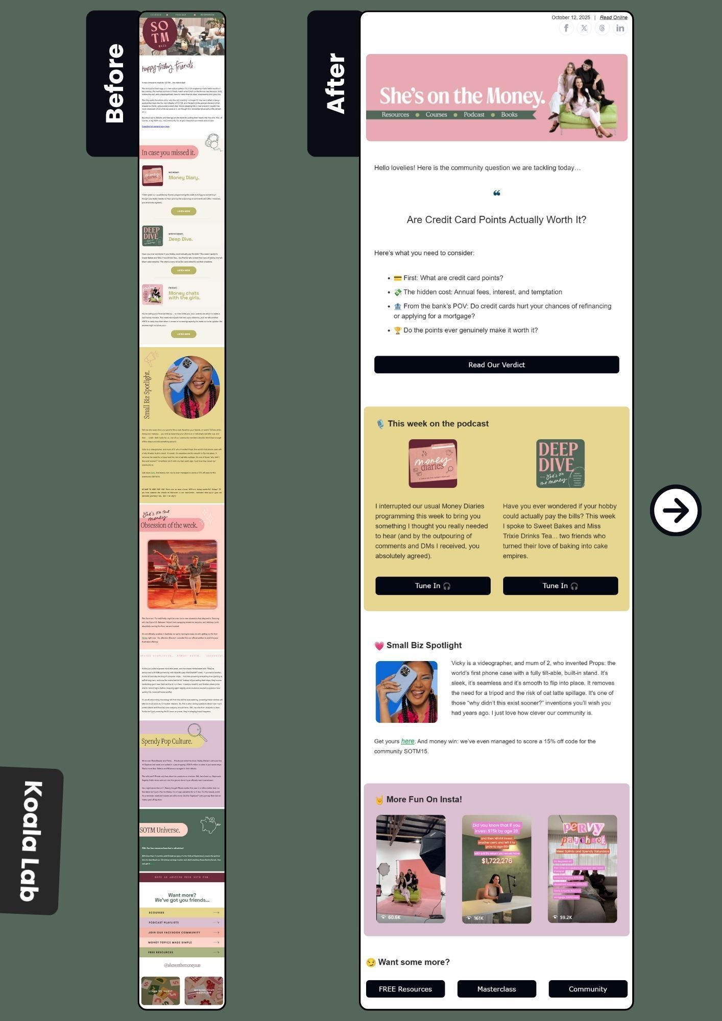
The original email was beautifully designed and packed with juicy, valuable content. But… it was also long. Really long.
My redesign focused on refining and reformatting the layout - keeping all the good stuff, while improving scannability and flow. The goal: help readers stay engaged without feeling overwhelmed.
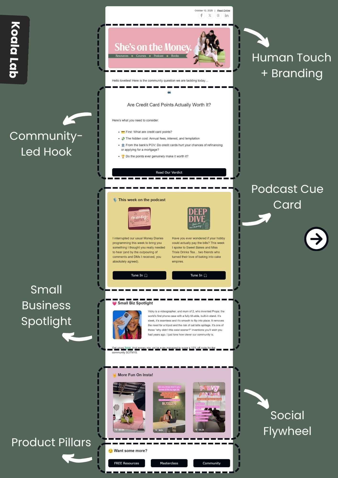
TL;DR - What my redesign focused on
1. Human Touch Branding
Warm intro + team photo builds instant trust and highlights key brand pillars.
2. Community-Led Hook
Leads with a relatable question - grabs attention and answers “why should I care?” right away.
3. Podcast Cue Cards
Two-column format breaks scroll fatigue and boosts podcast engagement.
4. Small Biz Spotlight
Celebrates community creators & builds trust and authenticity.
5. Social Flywheel
Showcases Instagram Reels to drive cross-channel engagement.
6. Business Ecosystem
Seamlessly connects all brand pillars - courses, community, and resources.
Deepdive 👇
Human Touch Branding
The email opens with a warm, welcoming tone - featuring a friendly team headshot and clear navigation to key product pillars (podcast, resources, and courses). This instantly establishes brand familiarity and trust while reinforcing She’s on the Money’s multi-channel ecosystem.
Community-Led Hook
Instead of jumping straight into a blog promo, the email starts with a community-driven question that sparks curiosity and conversation. This format directly tackles the “why should I care?” factor - creating a more natural, engaging, and scroll-stopping hook while promoting the blog.
Podcast Cue Cards
The design spotlights two podcast episodes side by side in a cue card layout. This two-column format breaks the traditional vertical scroll, creating a smoother reading experience while nudging subscribers to follow or listen ultimately boosting podcast engagement metrics.
Small Business Spotlight
A dedicated section shines a light on small businesses within the community. It’s a subtle but powerful trust-building element that adds depth to the brand narrative and reinforces community support.
Social Flywheel
Featuring recent Instagram Reels in the same cue card format encourages cross-channel interaction. It not only promotes consistency across platforms but also fuels a “content flywheel” where email drives social engagement, and social brings followers back to the newsletter.
Business Ecosystem Promotion
The closing section ties it all together by spotlighting other business pillars - courses, resources, and community spaces creating a cohesive ecosystem that deepens brand engagement and retention.
So…
No major surgery here - just a little design glow-up for an email that was already doing all the right things. Because when you’ve got great content and great branding, a cleaner format is just the cherry on top. 🍒
Half-Baked Thoughts 🍀🚬
Riddle: What’s a marketer’s favorite Halloween candy?
Answer: Click-or-treats. 🤣
🎬 Ad Alert
Experience the Next Evolution of AI Intelligence
Watch The Worlds First AI Built for Cognitive Amplification live on October 15.
See how Pressmaster.ai turns one conversation into thirty days of authentic and impactful content.
Register free to join the launch event and experience the future of AI communication.
✨ Until next time…

Sakshi | Co-founder at Koala Lab
Cheers to staying out of spam and in your heart! 🫰🏼

